A white exterior doesn't automatically make a home feel finished. The front door decides whether that clean backdrop reads as formal, welcoming, modern, natural, or distinctive. In fact, a 2026 Zillow analysis associated a light blue door on a solid white house with a potential $5,023 premium, while a white door on a white house performed worst for buyer interest and tour intentions. Zillow's summary also said the wrong door color could reduce offers by as much as $6,738, making contrast more than a decorative detail. See the Zillow-based analysis of front-door colors for white houses.
The ten choices below cover three practical directions: dramatic dark shades, reflective light neutrals, and personality-driven jewel tones. The right selection depends on more than the paint chip. Compare the white exterior's undertone, architectural style, hardware, landscaping, Texas sunlight, maintenance needs, and the performance of the door material before committing. For broader curb-appeal guidance, SuperiorPRO's door color tips for Atlanta offer another useful perspective, although Texas sun exposure calls for its own material and finish considerations.
Table of Contents
- 1. Classic Black
- 2. Navy Blue
- 3. Forest Green
- 4. Deep Burgundy or Wine Red
- 5. Soft Sage Green
- 6. Charcoal Gray
- 7. Rich Teal or Deep Turquoise
- 8. Warm Cream or Off-White
- 9. Deep Bronze or Metallic Copper
- 10. Soft Gray with Blue Undertones
- 10 Front Door Colors for White Houses, Comparison
- Choose the Color That Fits Your Home
1. Classic Black
Black is the strongest contrast choice for a white house, giving the entry a clear focal point and making uncomplicated siding look deliberate. It suits traditional colonials, modern farmhouses, and contemporary façades. Angi's guide to front-door colors for white houses likewise places black and other deep shades ahead of white-on-white combinations for creating definition.
Treat black as an entry strategy, not a paint color. Divided-light glass, a white porch, and traditional lanterns make the door feel formal. A smooth fiberglass slab with minimal trim and linear hardware shifts the same color toward modern. In Texas suburbs, ornamental grasses, live oaks, and warm stone can soften the high contrast around the entrance.
Build the whole entry around the shade
Sun exposure changes the practical choice. Black can carry more visual weight and absorb more heat than lighter colors, so a fiberglass entry door with a UV-protective finish is a sensible specification for a Texas-facing entry. Choose semi-gloss when dust and fingerprints are concerns. It wipes clean more readily than a textured matte surface.
Hardware sets the level of formality:
- Polished chrome or stainless steel: Sharpens the contemporary character.
- Matte black hardware: Creates a quiet, tone-on-tone composition.
- Antique brass: Softens the contrast and supports traditional architecture.
The casing does not have to match the door. If shutters, window frames, or lighting already supply dark accents, a black surround may make the porch feel heavy. Keep the casing white or limit the dark color to the slab. For a modern comparison of profiles, glass, and finishes, review modern black exterior doors from Breaking Glass Co.. Select the full entry package after checking the sample in direct Texas sun, reflected light, and shade.
2. Navy Blue
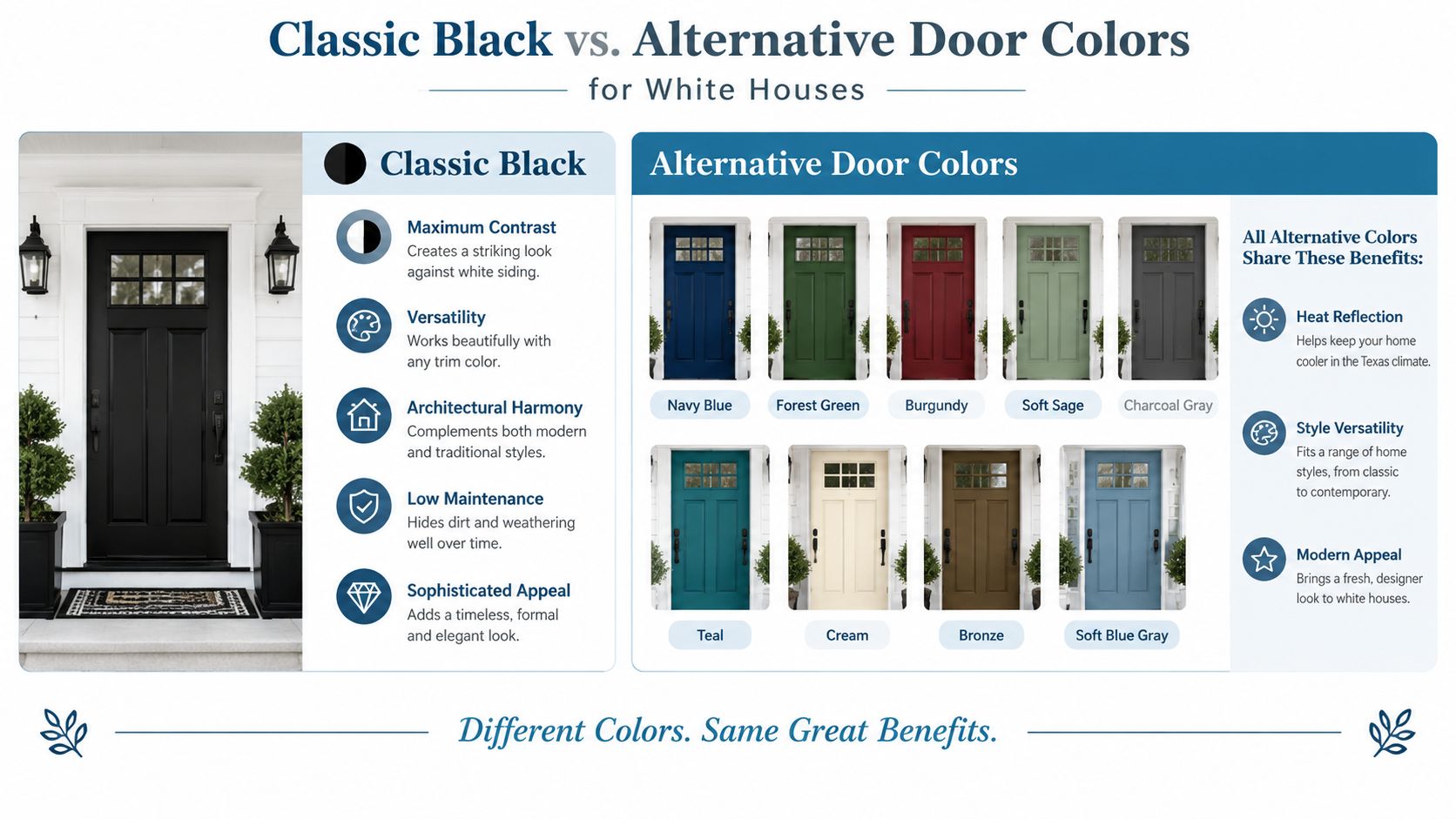
Navy gives you the authority of a dark door without the starkness of black. Against white siding, it creates strong contrast, but its blue undertone introduces more visual depth and a slightly more relaxed character. That makes it a natural fit for coastal-inspired homes, contemporary houses, and modern farmhouses with restrained trim.
The specific navy matters. A nearly black navy can look formal and architectural, while a clearer deep blue feels more welcoming. Hold the sample beside the actual white exterior, not against a white paper card. A cool white siding may make a blue navy appear especially crisp. A warmer white can pull out a softer, slightly muted quality.
Let hardware decide the formality
Navy is flexible because the hardware can push the entry in different directions. Polished nickel or brass gives the door an upscale finish, while a simple black lever keeps the composition modern. If the home has pale gray trim, navy can connect the cool undertones without creating a disconnected color patch.
Texas sunlight can flatten or intensify blue depending on the entry's exposure. Test the color in direct sun, reflected light, and shade before ordering. A satin or semi-gloss fiberglass finish offers a practical balance between color presence and cleanability, while a UV-resistant coating helps protect the appearance over time.
Practical rule: If black feels too severe but white feels too quiet, sample navy first. It preserves contrast while giving the entry more color character.
A Dallas or Austin home with white stucco, dark window frames, and simple landscaping can carry a saturated navy door easily. On a cottage with irregular stone, a softened navy may integrate better than a nearly black blue.

3. Forest Green
Forest green brings the surroundings into the entry. It works especially well when a white house sits among mature trees, native plantings, or natural stone because the color feels connected to the setting instead of added on top of it. The deep shade has enough contrast to define the door, yet it feels warmer and less formal than black.
This is a strong choice for traditional homes, cottages, transitional architecture, and rustic-modern exteriors. An English cottage-style home in the Texas Hill Country can use forest green with stone, timber, and informal planting. A Southern-inspired house with white columns can pair the same color with antique brass and symmetrical landscaping.
Check the green against the landscape
Green paint can shift dramatically beside grass, trees, and warm masonry. A blue-leaning forest green may look elegant beside cool white siding but harsh against yellow stone. A green with earthy or brown undertones often feels more grounded beside clay pavers, cedar, or tan limestone.
Use a matte or satin finish when the entry receives intense sunlight. Excessive gloss can make a deep green look brighter and more reflective than expected. Fiberglass is useful here because it accepts durable factory finishes and avoids the maintenance concerns associated with some wood doors in exposed locations.
Coordinate rather than match every detail. The door can echo shrubs or planters without duplicating them exactly. If shutters or porch furniture already carry a green note, repeat the hue in a restrained way. If the landscaping is colorful, keep the trim white and let the door provide the single strong accent.
A practical Texas test
View the sample during morning, afternoon, and evening light. Texas sun can make a green look more yellow, more blue, or nearly black depending on the surrounding surfaces. The best forest green is the one that still looks intentional when the porch is shaded, not only the one that looks attractive in direct sun.
4. Deep Burgundy or Wine Red
Deep burgundy and wine red give a white house a distinctive entry without the visual volume of a bright primary red. These shades bring warmth, hospitality, and a sense of history, which makes them especially effective on colonial, traditional, and transitional homes. They also work well when the exterior already includes warm brick, cream trim, bronze lighting, or dark shutters.
The undertone is the deciding factor. A burgundy with brown or muted plum notes usually feels more refined than a red that leans sharply purple. A warm white exterior supports the shade naturally, while a blue-white exterior may make the door appear more dramatic and less integrated.
Match the door to the architecture
A paneled fiberglass door in burgundy can reinforce a traditional facade, especially with sidelights and classic molding. On a very minimalist home, the same color may look disconnected unless the landscaping or hardware repeats its warmth. The entry needs a visual reason for the red to exist.
Antique brass and aged gold are natural hardware partners. Bronze can work too, particularly when the porch light, house numbers, and mailbox use the same finish. Bright chrome tends to introduce a cooler note, which can weaken the warmth that makes burgundy appealing.
Use a high-quality UV-protective finish, especially when the door faces strong afternoon sun. Dark reds can show fading unevenly if the finish isn't designed for exterior exposure. A satin or semi-gloss surface also makes routine cleaning easier in dusty Texas conditions.
Burgundy should look like an intentional architectural accent, not a leftover holiday color. Keep the surrounding palette calm, warm, and edited.
For a real-world scenario, consider a white traditional home with cream trim, a brick walkway, and bronze lanterns. Burgundy belongs in that composition. On a stark white contemporary facade with cool gray concrete, charcoal or navy may create a cleaner relationship.
5. Soft Sage Green
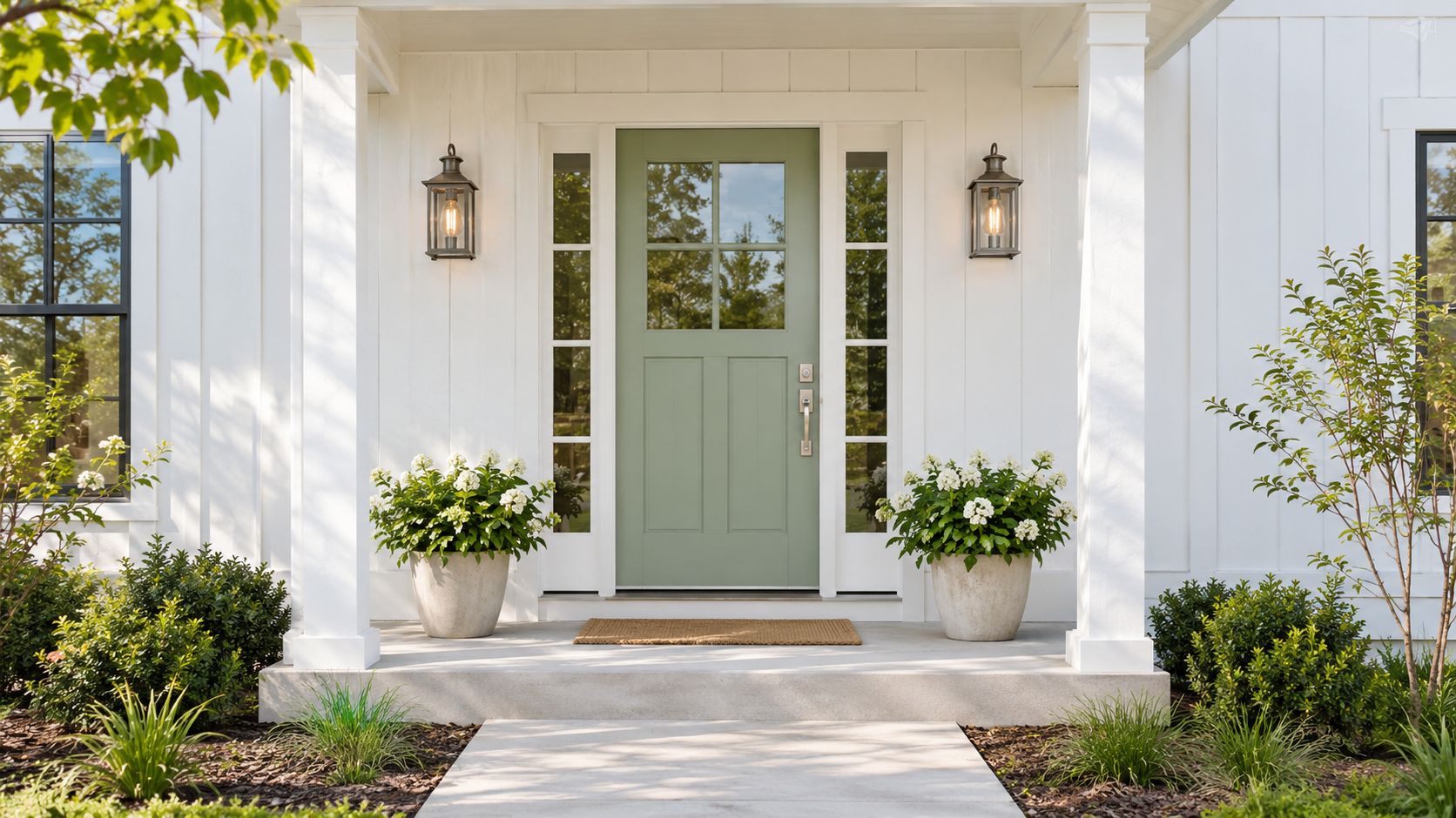
Soft sage is the quieter counterpart to forest green. Its gray-green character adds color without demanding the entire facade's attention, making it a useful choice for modern farmhouse, contemporary cottage, and transitional homes. Against white siding, sage creates gentle contrast and a welcoming, approachable mood.
This color is particularly sensitive to undertones. Some sages lean yellow and pair well with warm whites, natural wood, and tan stone. Others lean blue-gray and suit cooler whites, silver hardware, and pale gray trim. The wrong combination can make the door look dusty or faded rather than deliberately muted.
Sample for the full day
A sage chip can look balanced indoors and washed out in direct Texas sun. Place a large sample on the door or beside the entry and view it in morning, afternoon, and evening light. Check it from the street as well as from the porch, because distance reduces subtle color differences.
Brushed nickel and stainless steel keep the entry contemporary. Matte black can add definition, while aged brass introduces a more collected, traditional feel. A satin or matte finish generally supports sage better than a high-gloss surface, which can make the shade feel unexpectedly bright.
Use the white exterior as a frame. Keep the casing clean and avoid introducing too many competing accent colors. Potted plants, natural wood, and a simple porch light can supply enough texture without matching the sage exactly.
Material and maintenance
A fiberglass door with a premium exterior finish is a sensible specification for a Texas home exposed to heat and sunlight. Look for a coating intended for exterior UV exposure and follow the manufacturer's cleaning instructions. The color should support the architecture, but the finish determines whether that decision remains attractive after regular dust, pollen, and weather exposure.
6. Charcoal Gray
Charcoal gray sits between black and softer gray. It provides clear contrast against a white house but feels less severe than true black, which makes it well suited to modern, minimalist, and transitional architecture. On a clean-lined facade, charcoal can emphasize geometry without turning the entrance into the only dramatic feature.
The door works best when the rest of the exterior is edited. Pair it with white casing, simple landscaping, and restrained lighting. Too many dark accents can make a small porch feel compressed, especially if the roof, garage door, and window frames are already charcoal.
Choose the undertone deliberately
A charcoal with warm undertones can connect to natural wood, bronze hardware, and Texas limestone. A blue-leaning charcoal can look crisp beside a cool white but may feel cold against beige stone. Put the sample beside the actual siding and nearby masonry before choosing.
Hardware options are straightforward:
- Stainless steel: Keeps the entry sleek and contemporary.
- Matte black: Creates a unified modern palette.
- Warm bronze: Prevents the combination from feeling overly industrial.
A satin finish gives charcoal a modern appearance and makes cleaning manageable. Fiberglass is a practical substrate for this shade, particularly when the manufacturer offers a finish engineered for UV exposure. Dark colors can show dust and hand marks, so consider the entry's traffic and roof coverage before choosing a completely flat finish.
A new-construction home in Austin or Dallas with white stucco, black-framed windows, and concrete paving can carry charcoal effortlessly. On a heavily detailed Victorian or cottage facade, forest green or burgundy may preserve more of the home's character.
7. Rich Teal or Deep Turquoise
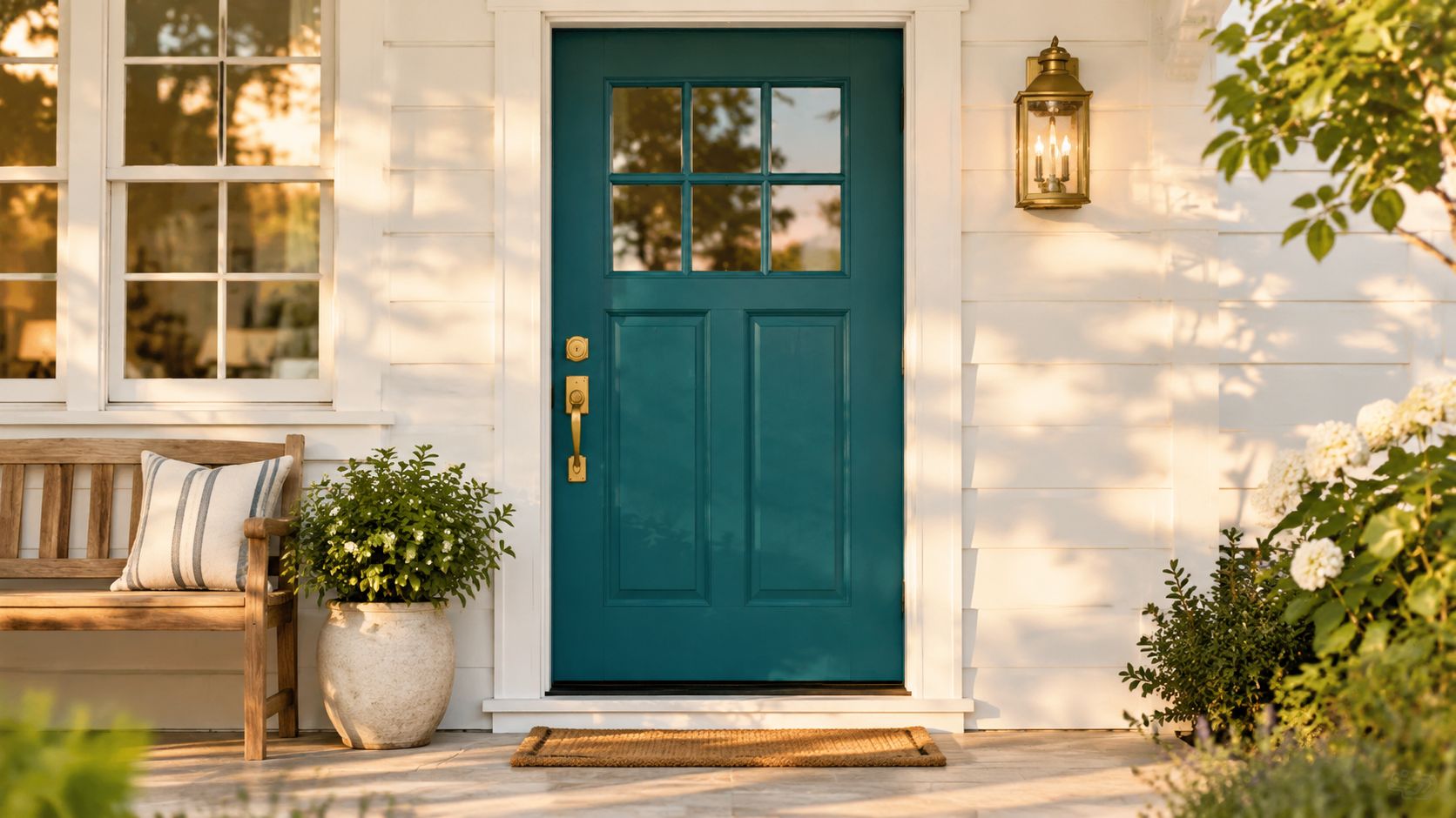
Rich teal creates the strongest personality statement in this group without relying on a bright primary color. It combines blue depth with green warmth, making it a good fit for eclectic, coastal, bohemian, and artistically detailed homes. A white exterior gives teal the space it needs to stand out.
Avoid selecting a turquoise that reads tropical or neon unless the architecture supports that energy. A deeper teal usually looks more refined and remains easier to coordinate with fixed exterior materials. It can echo blue-green landscaping, glazed planters, or a painted porch ceiling without requiring an exact match.
Keep the surrounding entry restrained
Teal already supplies visual movement. Use white or light gray trim, simple porch furniture, and one or two related colors. Brass hardware can make the door feel polished, while mixed metals support a more collected look. Matte black is another workable choice if the windows or lighting already use it.
The architectural setting matters. An Austin home in a creative neighborhood may support a saturated teal because the color reinforces an expressive facade. A formal suburban colonial may need a darker, grayer teal and traditional paneling to prevent the door from looking out of place.
Protect the statement color
Satin or matte finishes keep teal from becoming too reflective in bright sun. Choose a fiberglass door with a premium exterior finish designed for color longevity, and inspect the entry's exposure before finalizing the shade. A covered porch gives you more flexibility. A west-facing, unprotected door demands closer attention to UV resistance and cleaning.
8. Warm Cream or Off-White
A warm cream or off-white door works only when the architecture supplies enough definition. On a white house, low contrast can make the entry disappear, although that restraint can suit detailed moldings, deep sidelights, classical proportions, or a substantial porch. The door then directs attention to craftsmanship instead of competing with it.
The whites must differ in tone. A bright white exterior can frame a cream door cleanly, while a warm off-white facade with an almost identical door may look flat in strong Texas sunlight. White-on-white entries need tonal separation to remain visible. The 2026 exterior-door trend discussion from MasterGrain raises the practical question of whether a near-white door supports architectural detail or makes the facade feel too uniform.
Make hardware carry the contrast
Hardware has to provide much of the entry's definition. Polished brass, antique brass, and bronze warm up a cream door and connect well with traditional lighting or wood accents. Dark hardware creates a sharper, more graphic appearance. A substantial knocker, detailed trim, or decorative glass can add interest without introducing another paint color.
Match the entry strategy to the home. Traditional, colonial, and transitional houses with real architectural detail can carry this quiet treatment. A plain slab entry on a simple white ranch usually needs more contrast to establish a focal point.
Semi-gloss is practical in a dusty climate because it wipes clean easily. Light surfaces show dirt and scuffs in their own way, so plan for regular cleaning. On a fiberglass door, confirm that the exterior finish is intended for outdoor exposure and sample the color beside the siding in both direct sun and shade. A shade that looks distinct in a showroom can nearly disappear at the front of a Texas home.
9. Deep Bronze or Metallic Copper
Deep bronze and metallic copper turn the entry into a deliberate architectural feature, not merely a painted rectangle. Their warmth creates clear contrast against white siding and suits contemporary, transitional, and modern farmhouse homes. They also connect with copper lighting, bronze window hardware, warm stone, and wood accents.
Which finish fits the home better? A dark, low-sheen bronze stays restrained and emphasizes the door's shape. Copper is more expressive, especially when its surface varies or develops a patina. That change can add character, but confirm the expected finish before installation if you want a consistent appearance.
Coordinate the metal without overdecorating
Repeat the chosen metal in the handle, porch light, house numbers, or mailbox. One nearby echo is often enough to connect the door to the facade. Matching every exterior detail can make the entry feel overly themed.
The surrounding architecture sets the limit. A Dallas or Austin home with clean lines, large windows, and deliberate landscaping can support metallic warmth. A small cottage with several existing colors may look better with a darker bronze that absorbs light instead of a reflective copper that becomes the main feature.
Texas sunlight makes the finish and surface texture practical decisions, not just style choices. Select a powder-coated or specialty exterior finish, then ask how it handles direct sun, abrasion, and cleaning. Confirm whether the manufacturer expects the color to change over time. A fiberglass door can provide a stable structure while the finish supplies the visual character, but verify that the coating is approved for that door material and exposure.
Before ordering, compare the complete replacement scope, including the frame, sill, glass, handle, and installation. Breaking Glass Co.’s front door replacement information can help homeowners assess the entry as a complete system rather than choosing paint alone.
View the sample beside the white exterior, roof, walkway, and porch lighting at different times of day. Metallic finishes can shift noticeably between direct sun and shade, so the entry should work in both conditions.
10. Soft Gray with Blue Undertones
Soft blue-gray is a measured alternative to navy. It adds enough color to distinguish the entry from a white facade while staying within a neutral, contemporary palette. This makes it effective on transitional homes, modern farmhouses, and clean-lined new construction.
The risk is insufficient contrast. A pale blue-gray beside a cool white can look elegant, but a very light shade beside a warm white may read as nearly white. If the door is recessed or shaded, the color may become even less visible from the street. Select a sample with enough depth to retain its identity in shadow.
Use the door to connect cool and warm materials
Blue-gray pairs naturally with stainless steel, brushed nickel, and matte black hardware. It can also work with warm wood or stone if the gray has a balanced, slightly softened undertone. Avoid choosing the door from a screen image. Surrounding materials and regional light can change the color substantially.
A satin or eggshell finish supports the contemporary character and reduces harsh reflection. For a Texas entry, a premium fiberglass door with a fade-resistant finish offers a practical combination of style and weather resistance. If you already have a fiberglass door, Breaking Glass Co.’s guide to painting a fiberglass entry door can help you evaluate preparation, finish, and repainting considerations before changing the color.
A contemporary home in Austin with pale siding, dark windows, and light concrete may benefit from blue-gray because it softens the contrast without becoming colorful. On a traditional home with red brick and warm cream trim, navy, burgundy, or bronze may create a more coherent entry.
10 Front Door Colors for White Houses, Comparison
| Color | 🔄 Implementation Complexity | ⚡ Resource & Maintenance | 📊 Expected Outcomes | 💡 Ideal Use Cases | ⭐ Key Advantages |
|---|---|---|---|---|---|
| Classic Black | Low, standard install; specify UV-protective finish for hot climates | Low, hides dirt; occasional repainting; needs UV coating for longevity | Striking contrast and formal curb appeal; higher heat absorption without coatings | Traditional, modern farmhouse, colonial, high-end entries | ⭐⭐⭐⭐⭐ Timeless versatility; boosts perceived value; easy upkeep |
| Navy Blue | Low, standard finish; best with UV-resistant option | Moderate, better heat performance than black; use fade-resistant coating | Strong contrast without severity; appears warmer than black | Coastal, contemporary, modern farmhouse designs | ⭐⭐⭐⭐ Refined alternative to black; pairs well with brass/bronze |
| Forest Green | Low, simple application; shade selection matters | Low, reflective vs. black; recommend fade-resistant finish | Natural, inviting aesthetic; good heat reflection and dirt hiding | Cottage, traditional, rustic modern, suburban homes | ⭐⭐⭐⭐ Connects to landscape; warm and welcoming |
| Deep Burgundy / Wine Red | Moderate, tone-sensitive and may need custom matching | Moderate, high-quality UV finish required; repaint matching can be hard | Dramatic, luxurious focal point; can absorb heat if dark | Colonial, historic, upscale residential properties | ⭐⭐⭐⭐ Distinctive, elegant, strong architectural presence |
| Soft Sage Green | Low, sample in multiple lights; easy application | Low, excellent heat reflection; may need more frequent touch-ups | Calming, contemporary look with good reflectivity | Modern farmhouse, cottage, transitional homes | ⭐⭐⭐⭐ Trendy yet timeless; excellent heat performance |
| Charcoal Gray | Low, standard finish; pick warm undertones if needed | Low, less heat absorption than black; durable finish recommended | Modern sophistication with strong but softer contrast | Minimalist, contemporary, new construction homes | ⭐⭐⭐⭐ Contemporary, versatile, lower heat uptake than black |
| Rich Teal / Deep Turquoise | Moderate, often custom finish for depth and longevity | Moderate, premium finish advised to retain vibrancy | Bold, memorable focal point; good light reflection | Eclectic, bohemian, creative neighborhoods | ⭐⭐⭐⭐ Vibrant and distinctive; appeals to design-forward homeowners |
| Warm Cream / Off-White | Low, straightforward application; best with detailed architecture | Low, maximum heat reflection; shows dirt more readily | Subtle, refined look that emphasizes trim and details | Colonial, historic, and classically detailed homes | ⭐⭐⭐⭐ Timeless, elegant, highlights architectural features |
| Deep Bronze / Metallic Copper | High, specialty or custom finishes; possible professional install | High, specialty coatings (powder-coat) and maintenance; patina over time | Luxurious, warm statement; upscale visual impact; good heat reflection | Luxury, contemporary, transitional, high-end projects | ⭐⭐⭐⭐ Upscale, warm metallic depth; complements natural materials |
| Soft Gray with Blue Undertones | Low, shade testing recommended; standard application | Low, excellent heat reflection; use fade-resistant finish | Refined, modern neutral with subtle interest; versatile across styles | Contemporary, transitional, modern farmhouse | ⭐⭐⭐⭐ Versatile, modern-timeless, broadly appealing |
Choose the Color That Fits Your Home
Start with the architecture, not the trend. Black, navy, and charcoal create the strongest definition and suit homes with clean trim, dark windows, or formal proportions. Forest green and sage connect the entry to trees, planting, stone, and natural materials. Burgundy adds traditional warmth, while teal gives an expressive facade a clear personality. Cream and soft blue-gray can be beautiful, but both depend on enough tonal or architectural contrast to keep the doorway visible. Bronze and copper shift the focus from paint color to material and craftsmanship.
Then look at the hardware. Chrome and stainless steel sharpen black, navy, and blue-gray. Brass and bronze warm burgundy, forest green, cream, and metallic finishes. Matte black is versatile, but it can make a dark door feel heavier when the porch already has dark windows, lighting, or shutters. Your handle, lockset, knocker, house numbers, and light fixture should read as one entry package.
Sun exposure deserves equal attention. Texas light can make saturated colors appear brighter and can expose fading or surface dust quickly. A covered porch gives you more flexibility, while an unprotected entry facing strong afternoon sun calls for a durable exterior finish and careful material selection. Fiberglass entry doors are particularly practical for homeowners who want stable performance, weather resistance, and a wide range of finishes, but the coating still needs to be specified for exterior UV exposure.
Sample the complete entry, not just the paint. Place large color samples beside the siding, casing, roof, masonry, hardware, and landscape. View them in morning, afternoon, and evening light.
The question of white or near-white deserves special care. Current design guidance is split between timeless warm whites and richer, more expressive door colors, so the useful test isn't whether white is fashionable. It's whether your door has enough molding, sidelights, shadow, or hardware contrast to remain visually present. In a dense neighborhood or a bright climate, a low-contrast entry may read differently than it does in a shaded, wooded setting. That performance gap is still underexplored in everyday design coverage, which often shows examples without comparing resale, curb appeal, sun exposure, or architectural style in a consistent way. MasterGrain's 2026 trend coverage provides helpful context for that unresolved comparison.
If you're replacing the door, select the fiberglass profile, glass pattern, handle, frame, weatherstripping, and finish together. A color that looks excellent on a sample can fail when the glass, casing, or hardware introduces a competing undertone. Homeowners planning a Texas project can review fiberglass entry-door options and request a quote from Breaking Glass Co.’s website, where product and installation information can be considered together.
Breaking Glass Co. supplies and installs fiberglass entry doors for Texas homes, with options for color, glass pattern, and handle coordination. Visit Breaking Glass Co. to compare front-door solutions, request a quote, and plan installation around your home's architecture and Texas climate.